"It's ridiculous that insurers get between my doctor and the best treatment they're prescribing me."
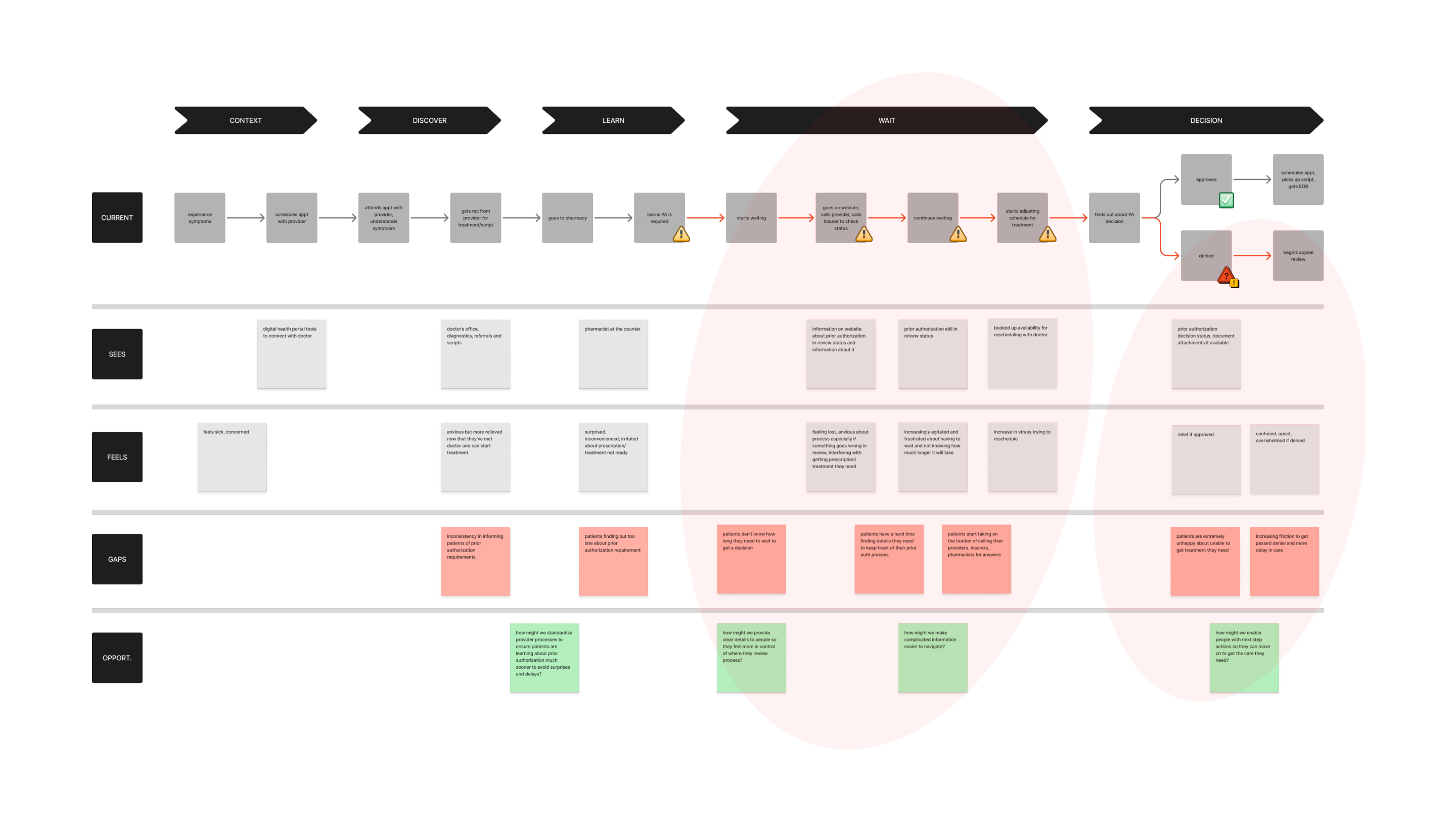
Prior authorization is a behind-the-scenes review process between providers, pharmacists, and insurers to justify that the treatment needs prescribed by a doctor adheres to the patients health plan. Unfortunately, in the middle of this transactional process, patients feel the impact the most as they're the ones who get stuck in it. They're confused and unsure about what they can do next as they wait and wait for a decision from the review. And if that decision is a coverage denial, it adds emotional stress and burden to the already complicated and frustrating experience, risking further delay in getting the care they need. It ultimately breaks their trust in the pharmacy benefit service with increasing negative sentiment.
As long as prior authorization existed, I knew we couldn’t change how people felt about them as prior authorization as a policy was not going to disappear. But by listening to people and their stories, and identifying the highest points of friction through data analysis, interviews, and usability testing I co-led with my research partner, we were able to find and validate key areas of opportunities to help users navigate the process more clearly and confidently.
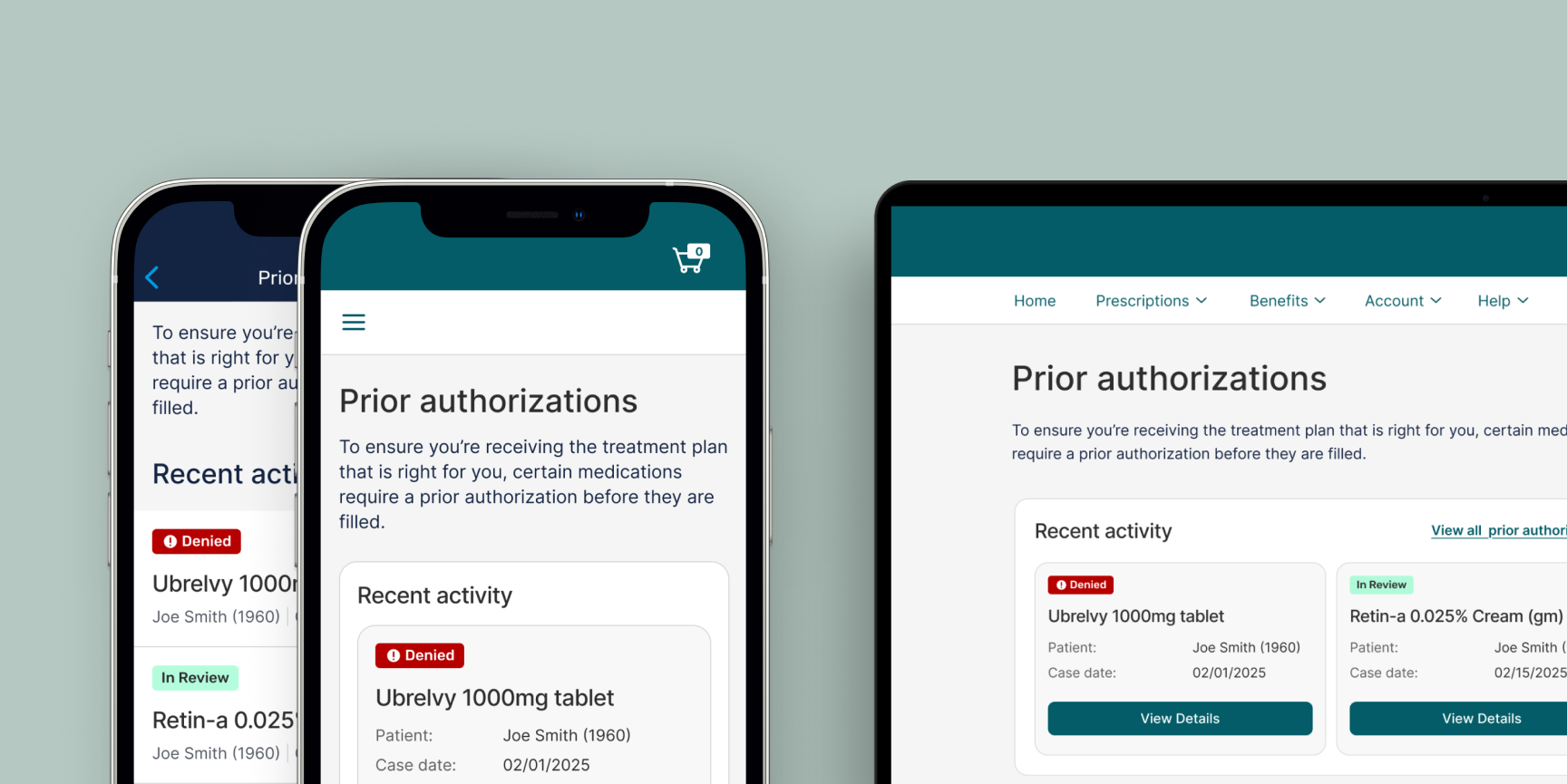
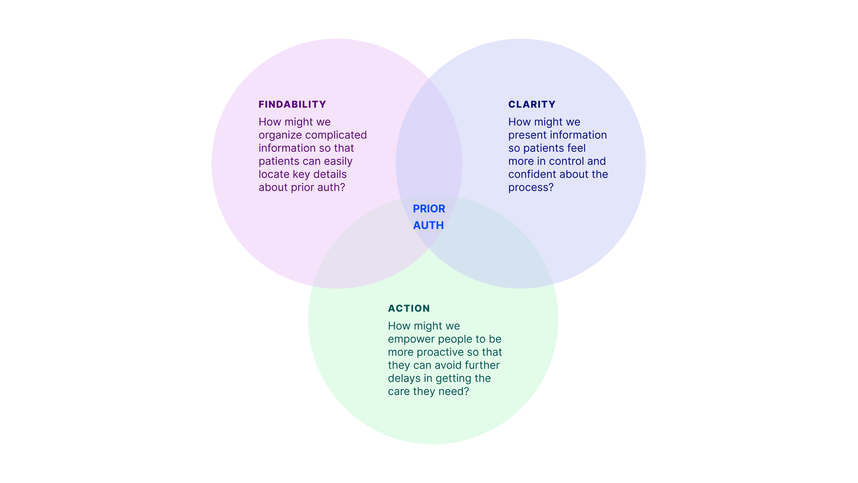
My goals around findability, clear information, and action-oriented next steps shaped where I focused in the end-to-end patient journey. The goals I set also guided how I advocated for users and my decisions throughout the design process. This led to a series recommendations I delivered:
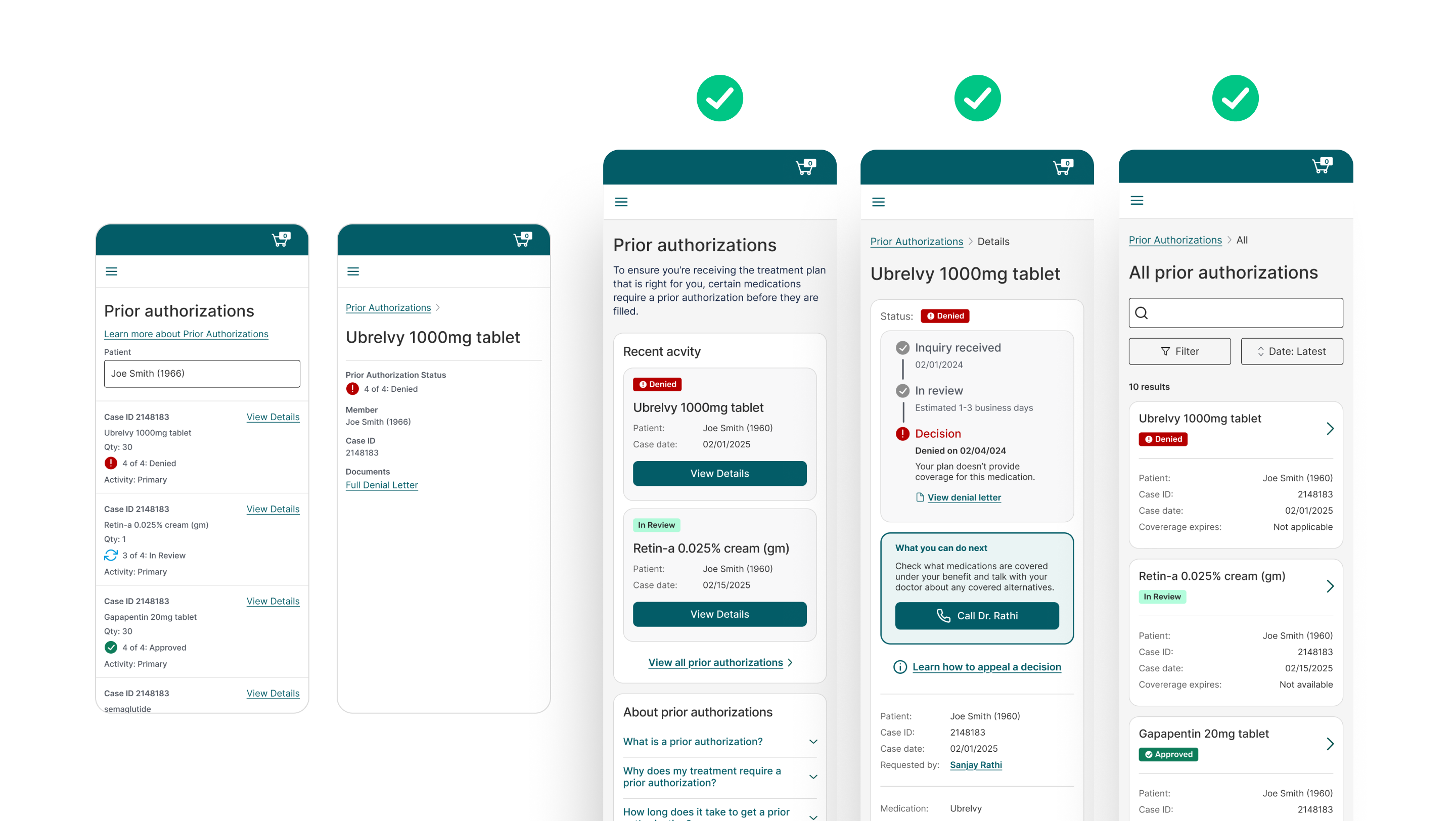
My contributions as lead designer resulted in an enhanced digital prior authorization experience that made patients feel clearly informed, in control, and empowered to confidently navigate a complicated and time-consuming workflow unlike before.
"I hate the preapproval process and that's never going to change. If I had these features earlier it would have really helped me to get what I needed to move on."
Connect with me for more case study details